How to Create an Instagram-Worthy Cafe Interior
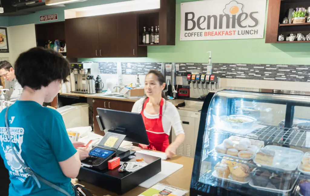
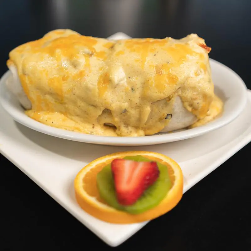
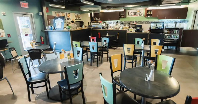
A cafe interior that photographs well is not the same thing as a cafe interior that works well. That distinction matters. A room can look striking in a staged photo and still feel awkward once the morning queue forms, the milk fridge hums, and twelve people try to find seats near power outlets. The best Instagram-worthy spaces do both. They stop people mid-scroll, and they make them want to stay for a second coffee.
The most successful cafe interiors understand a simple truth: people do not photograph furniture, paint colors, or pendant lights in isolation. They photograph atmosphere. They photograph the way light falls across a terrazzo counter at 9:30 a.m. They photograph the pastry case because it glows. They photograph themselves because the background flatters skin tones and the room says something about their taste. If you design only for aesthetics, the room feels hollow. If you design only for function, it rarely gets shared. The sweet spot is where operational logic and visual identity become inseparable.
Start with a point of view, not a Pinterest board
Many owners begin by collecting references. That is useful, but it can also flatten a concept before it has a chance to mature. A board full of arched mirrors, pale oak, boucle chairs, and neon signs might be trendy, but trends are not a brand. Before choosing finishes, define what people should feel the moment they step inside your cafe.
Should the room feel calm and restorative, like a neighborhood retreat? Should it feel energetic and social, the kind of place where weekend lines become part of the buzz? Is the cafe rooted in local craft, or is it meant to feel polished and cosmopolitan? Those decisions shape everything from the ceiling color to the height of the banquette.
I have seen owners spend heavily on imported fixtures, then realize too late that the room communicates nothing specific. It looks expensive, but not memorable. A tighter concept often performs better. One small cafe I visited had a limited budget, but it leaned fully into a bakery studio identity. Open shelves displayed bread at eye level, wall sconces cast warm directional light, and the palette echoed flour, crust, and stone. Nearly every guest took a photo, not because the room shouted for attention, but because it felt coherent.
A strong interior concept should be simple enough to summarize in one sentence. If you cannot describe the mood and personality of your cafe clearly, the design will drift.
Design the room from the camera outward
Instagram-worthy design is often discussed as if it were decoration. In practice, it is staging. That does not mean fake or overdesigned. It means you understand how the room reads in a frame.
Most customers take photos from a few predictable angles. They shoot from the entry, from seated eye level, from across the table, and in front of the strongest focal wall. Staff, meanwhile, post drinks at the bar, pastries near the till, and wide room shots before opening. Design for those moments.
Think about what appears behind the cup. A beautiful cappuccino can look underwhelming if the table surface is dull, the chair upholstery clashes, or there is a tangle of extension cords in the background. The reverse is also true. A simple coffee can look luxurious when it sits on a table with texture, near a window with soft side light, against a wall with depth and restraint.
This is where composition matters more than ornament. If every surface is loud, nothing photographs well. A room needs visual hierarchy. One or two hero moments, supported by quieter zones, usually outperform a space where every wall competes for attention.
A practical approach is to identify three core photo opportunities before the build-out is finalized. These might include a statement counter, a window seat, and a branded wall or shelving vignette. Once you know those anchors, you can shape circulation and lighting around them.
Light is the real luxury
If budget forces hard choices, protect the lighting plan. People forgive simpler furniture faster than they forgive bad light. Harsh downlights flatten faces, make pastries look dry, and create dark eye sockets in selfies. Overly dim rooms can feel moody in person but muddy on camera. Good cafe lighting has range.
Natural light is your greatest asset if you have it. Large front windows, clerestory glazing, or even a single bright side exposure can define the whole room. The mistake many operators make is failing to manage that light. Direct afternoon sun can blow out photos and make seating uncomfortable. Diffused daylight, by contrast, is flattering and remarkably forgiving.
Window treatments should soften, not smother. Sheer curtains, lightly textured films, or carefully positioned planting can break glare without making the interior feel closed off. At night, artificial lighting needs to take over gracefully. That usually means layering rather than relying on one source.
A useful lighting mix often includes the following:
- Ambient light that gives the room even baseline brightness.
- Accent light that highlights shelves, artwork, or the pastry display.
- Task light where baristas work, so service remains efficient.
- Decorative fixtures that create identity and look good in photographs.
- Warmth control, usually in the 2700K to 3000K range, to keep skin tones and wood finishes attractive.
That final point is easy to underestimate. Color temperature affects mood immediately. Cool white light can make a minimal interior feel sterile. Warm light tends to flatter food, timber, fabric, and people. For most cafes, that warmth is part of the invitation.
Build one unforgettable focal point
A room does not need ten viral details. It needs one or two memorable ones executed properly. This focal point could be architectural, graphic, material, or spatial. The key is that it should feel native to the cafe, not pasted on for social media.
A curved plaster counter can work beautifully if the rest of the interior supports its softness. A tiled service bar can become iconic if the color choice is distinctive and the grout lines are crisp. A dramatic communal table under a sculptural pendant can anchor the whole room. Even a pastry display can become a signature feature if it is framed correctly and lit like a jewel box.
Neon signs are the most obvious attempt at an Instagram wall, and sometimes they work. More often, they age quickly because they say too much and reveal too little. A better strategy is subtle recognizability. Distinctive wall texture, custom millwork, unusual shelving, or a repeated shape can become just as shareable because people begin to associate that visual language with your cafe.
There is also a business case for restraint. A gimmick pulls attention once. A point of view earns repeated visits, organic tags, and customer loyalty.
Materials need to survive real life
An interior can be photogenic on opening day and exhausted by month six. The difference is usually material judgment. Cafe environments are punishing. Chairs scrape, milk spills, takeaway lids leak, sunlight fades fabrics, and cleaning crews use whatever products the staff can source on short notice.
The finishes that look good online often fail fastest in service. Very porous stone stains. Delicate matte paint shows every scuff near chair rails. Pale grout around the service zone can discolor within weeks. Boucle and loose-weave upholstery collect crumbs and wear unevenly. None of this means you must choose bland, commercial-grade surfaces everywhere. It means beauty has to be stress-tested.
I usually advise owners to separate visual drama from high-abuse areas. Put your more precious material where customers notice it but do not grind it underfoot all day. Let tabletops be durable and attractive. Let flooring handle traffic without demanding heroic maintenance. In a cafe, easy cleaning is part of the design brief, not an afterthought.
Texture is especially useful here. A heavily grained timber, a tactile tile, limewash, brushed metal, and honed stone can hide the small marks of daily life better than perfectly smooth surfaces. They also photograph with more depth. A room that has slight variation in sheen and texture almost always feels richer than one that relies only on color.
Seating should flatter the guest and the workflow
The uncomfortable truth about many visually famous cafes is that people do not stay long. The seating looks elegant, but the proportions are wrong, the tables are too small, or the circulation is awkward. If you want your cafe to become a place people genuinely post from, they need enough comfort to settle in.
Instagram-worthy does not require lounge-level softness. It requires thoughtful ergonomics. Seat height, table height, legroom, back support, and aisle width all affect whether a room feels generous or frustrating. A cafe can mix seating types, but each one should have a purpose. Window perches suit quick solo coffee stops. Two-tops drive turnover and intimacy. Banquettes are efficient and photogenic. A larger communal table creates energy, especially during slower hours.
A common mistake is shrinking table size to fit more covers. Then drinks, plates, phones, and laptops compete for inches, and every customer photo looks cramped. Slightly larger tables tend to improve both experience and imagery. They give the composition room to breathe.
Operationally, service pathways must remain clear. No one wants a perfect corner seat if they get bumped by staff carrying trays every four minutes. The room should feel composed from the customer’s perspective, but it should also reduce friction behind the scenes. The smartest interiors hide this discipline so well that guests simply experience the cafe as effortless.
Color does more work than most owners expect
Color sets emotional temperature faster than almost any other design element. It also determines how people and products appear on camera. Bright white can make a room feel crisp, but it can also overexpose photos and make pastries look less warm. Very dark palettes can feel dramatic, though they often need more lighting investment to avoid looking murky.
Mid-tone neutrals remain popular for a reason. Clay, oat, mushroom, dusty olive, tobacco, soft charcoal, and muted mineral tones create depth without dominating the image. These shades tend to flatter coffee, skin, ceramics, and baked goods. They also age better than trend-driven statement colors used wall to wall.
That said, a controlled hit of color can become a signature. A deep green banquette, a rust glazed tile, or a powder blue front door can give the room identity. The mistake is spreading accent color too broadly until it becomes noise. A palette usually works best when it has a stable base and one or two moments of tension.
Branding should live inside this palette, not fight it. Menus, packaging, uniforms, takeaway cups, and signage all appear in photos. If your graphic system clashes with the room, the visual impression becomes messy. The most photogenic cafes make branding feel inevitable, as if every element belongs to the same conversation.
Greenery helps, if it is intentional
Plants have become the default shortcut for making a space feel alive. Sometimes that instinct is right. A cafe with hard materials and clean lines can benefit enormously from organic shape and softness. But scattered planters do not create atmosphere by themselves.
Use greenery where it can shape the space. A taller plant near the entry can frame the threshold. Hanging foliage can soften a window line. A cluster on shelving can break up rigid geometry. Small tabletop arrangements can work, though they need maintenance and should not crowd service.
The practical issues matter here. Plants near espresso machines, entry doors, or cold drafts may struggle. Dust collects quickly in hospitality spaces. Dead leaves undermine the polished look you worked to build. It is better to use fewer plants and care for them properly than to force a jungle concept that the team cannot maintain.
Dried arrangements, branches, or sculptural seasonal stems can be a strong alternative in lower-light spaces. They deliver silhouette and texture without pretending to be lush tropical foliage where the conditions clearly do not support it.
Keep the counter area camera-ready
The bar is often the visual heart of a cafe. It is where product, craft, and rhythm converge. It is also where clutter accumulates first. Syrup bottles, receipt paper, cleaning cloths, spare lids, cardboard boxes, and delivery notes can destroy the polished impression of an otherwise beautiful room.
Design storage early. If staff do not have convenient places to put things, the counter becomes a temporary dumping ground that turns permanent. Open shelving can look beautiful, but only if what lives there remains disciplined. Closed storage is not less aesthetic when it protects the visual calm of the room.
The front face of the counter deserves particular attention because it appears in countless guest photos. Texture, shadow, and detailing matter. The same goes for the backdrop behind the bar. Cups, grinders, and equipment can read as craft or chaos depending on layout. The best service areas look active, not busy.
A useful test is to stand where customers queue and take three photos on your phone: one of the full counter, one of the pastry zone, and one toward the barista work area. If those images already feel crowded before service starts, the design or storage plan needs revision.
Small details are what make people tag you
A shareable cafe is rarely built only from big gestures. More often, it earns attention through accumulation. The cup shape feels right in the hand. The water glasses catch the light. The menu holder is custom. The bathroom mirror is flattering. The takeaway bag matches the tile tone. None of these elements make the room alone, but together they create the sense that someone cared.
Customers notice that care, even if they cannot name it. It shows up in what they photograph. A well-designed sugar station, a neatly integrated charging point, a coat hook that does not look like an afterthought, a door handle with satisfying weight, these all influence perception. Hospitality is physical. People remember spaces through touch and routine as much as sight.
This is one of the biggest differences between merely stylish cafes and enduring ones. Enduring spaces feel edited. They do not overwhelm. They anticipate.
Plan for different times of day
The photo that sells your cafe online might be taken in bright morning sun, but your guests will judge it at 7 a.m., 2 p.m., and after dark. Designing for only one lighting condition is a missed opportunity.
Morning tends to reward freshness and clarity. Lunchtime needs resilience as the room gets louder and busier. Late afternoon can reveal every weak point in your lighting and seating comfort. Evening, if you operate then, asks for intimacy without sacrificing visibility.
Walk through your design decisions against those shifts. Does the window seat become too hot at noon? Does the pastry case still look appealing after sunset? Does the focal wall disappear in low light? Does the music and acoustics support the mood you are trying to create?
Acoustics deserve special mention because they affect shareability Cafe indirectly. If people cannot hear each other, they spend less time in the room and are less likely to linger, order again, or document the experience positively. Hard surfaces may photograph beautifully, but without some softening through upholstery, curtains, acoustic panels, or well-placed joinery, the room can become fatiguing quickly.
Where to spend, where to save
Not every cafe has a large budget, and not every good interior needs one. The smarter move is usually selective investment. Spend where the customer notices quality every day, and save where substitution does not dilute the experience.
Here is a sensible priority order for many projects:
- Lighting and electrical planning.
- Flooring and high-contact surfaces.
- The main counter and one signature focal point.
- Comfortable, durable seating.
- Styling layers such as art, accessories, and secondary decor.
Owners often reverse this sequence, spending early on decorative items because they are visible and emotionally rewarding. Then the money runs short for custom joinery or proper lighting control. That usually shows. A cheaper vase can look expensive in a strong room. An expensive vase cannot rescue a weak one.
The most photogenic spaces still feel personal
The internet has made visual references global, which is both useful and dangerous. The same pale minimalism appears in cities that have different climates, street life, architecture, and customer habits. A cafe interior becomes more compelling when it responds to its actual context.
That could mean using materials that echo the neighborhood, commissioning local makers, preserving an original floor, or borrowing cues from nearby architecture. It could mean leaning into a building’s quirks rather than covering them. Some of the most memorable cafes are not polished to perfection. They are distinctive because they reveal where they are and who made them.
People are very good at sensing authenticity. They may not use that word, but they respond to spaces that feel lived in, rooted, and intentional. Those spaces get photographed more because they offer something people cannot find everywhere else.
An Instagram-worthy cafe interior is not really about Instagram. It is about creating a room people want to enter, inhabit, and remember. If the interior supports the coffee, the service, the brand, and the rituals of daily use, the photos will come naturally. And when they do, they will show more than a design trend. They will show a place with identity.
Bennies Cafe
17230 Jackson Creek Pkwy Ste 100, Monument, CO 80132
+1 719-445-0660
FAQ About Cafe
What is considered a café?
A café is generally an informal place to enjoy refreshments and a meal. Bennies Cafe in Monument serves breakfast and lunch in a counter-service setting, with options including eggs Benedict, sandwiches and crepes. Guests can eat in or arrange pickup.
What is the difference between a coffee shop and a café?
The terms often overlap. A coffee shop usually emphasizes coffee and other drinks, while a café may offer a broader food menu. Check the individual establishment's menu rather than relying on its name. Bennies Cafe offers coffee drinks alongside breakfast and lunch dishes.
What is the difference between café and coffee?
In everyday English, a café is a place where people buy food and drinks, while coffee is the beverage. The word café comes from the French word for coffee. Bennies Cafe serves options such as brewed coffee, espresso and lattes as part of its drinks menu.